NYC Taxi Insights: Unraveling Patterns and Optimization Strategies
Introduction
In the bustling metropolis that is New York City, the yellow taxi is an iconic symbol of urban transportation. Nowadays, taxi or transport companies (such as Uber) are essentially data companies. By gathering large amounts of data on pick-up and drop-off times and locations, these companies draw incredible insights into the demand of drivers in different areas. In the case of Uber, they even regulate the price with demand. To keep things a bit simpler, we look at regular taxis in New York that use a taximeter to calculate the price.
The Dataset
The NYC Taxi Fare dataset is openly available on Microsoft. It contains roughly 50GB of data of trips per year. These millions of trips include features such as pick-up and drop-off locations, timestamps, the fare amount, and driver IDs. Armed with this data, our data science journey begins.
Objective
First, we take the perspective of a taxi driver and try to understand how we can maximise our income. Then, we change the perspective to that of a taxi company where we want to maximise the income of the taxi company. In both cases, it is important to identify peak hours, understand what influences the fare amount and how to minimise the waiting time between trips.
Data Exploration and Cleaning
Before deriving insights or doing anything, we need to clean the data. The data set comes with a couple of issues and faulty data. We try our best to restore most of the faulty data, but since we have this vast amount of data, it is smarter to remove any data that is faulty.
Spatial Analysis
Starting with the spatial data, we find that many pick-ups and drop-offs are outside of NYC. Restricting ourselves to pick-ups and drop-offs only inside NYC already paints a good picture of Manhattan.
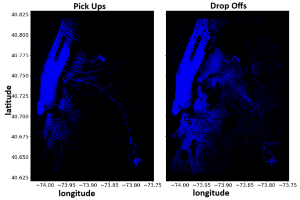
First insights. The pick-ups are clustered more around Manhattan, while the drop-offs are more spread out. Including the time analysis, we find that more people take the taxi back home from work, but rather go to work by other means of transportation.
To better describe the spatial feature, we will introduce clusters. For this job, we use K-medoids, which is similar to K-means, but is more stable when outliers are present as the cluster centres are part of the cluster. I had to add a couple of clusters by hand in the suburbs to better divide between the Airports and the surroundings.
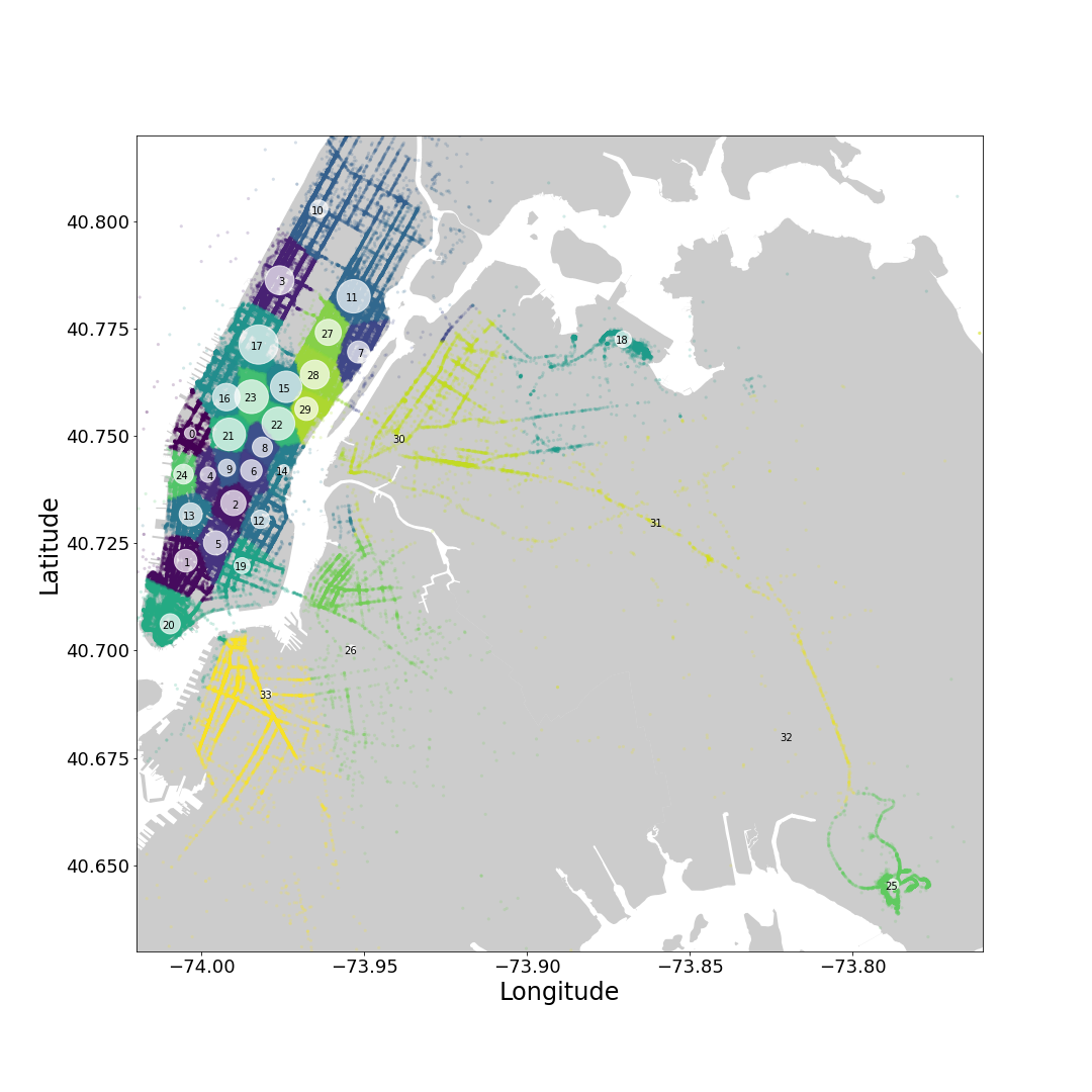
Each pick-up and drop-off can now be assigned to a cluster and we can analyse features for each cluster
Time analysis
Next up, we look at the number of pick-ups (and drop-offs) at a given time of the day.
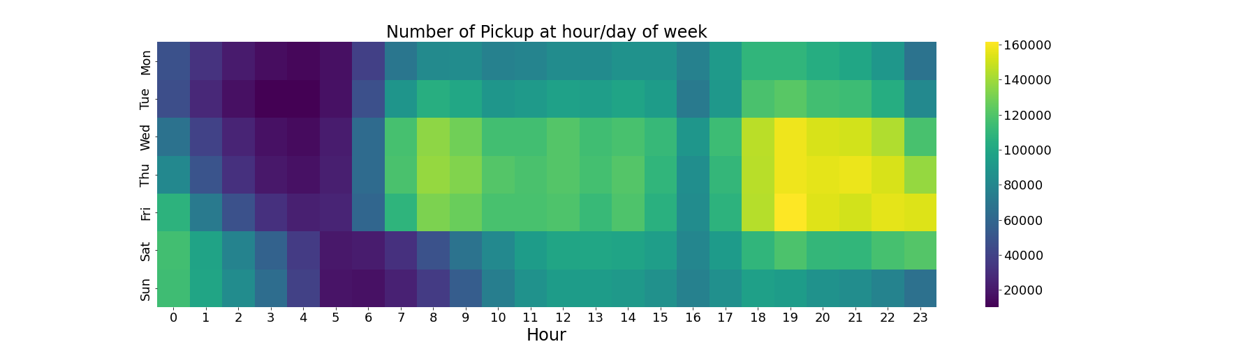
We can identify two peak hours: 8 AM - 3 PM & 6 PM - 11 PM. Wednesday to Friday are the busiest days, while Sunday and Monday are more quiet days. Generally, there are more pick-ups during the evening peak hours than the morning peak hours. Using the clusters, we can now visualise how the pick-ups and drop-offs spread over the city.
Feature Engineering
From the existing data, we can derive features that will be important for fare forecasting. As usual, the time data includes way more information than one might expect at first sight.
Work Hours and Wait Time
First, we can derive the working hours for each driver. Using the driverID feature, we derive the wait time between different rides. If the wait time is longer than a couple of hours, we can conclude that this was the last shift of the driver. Calculating the average wait time in regards to the time of day and location, we get the following results
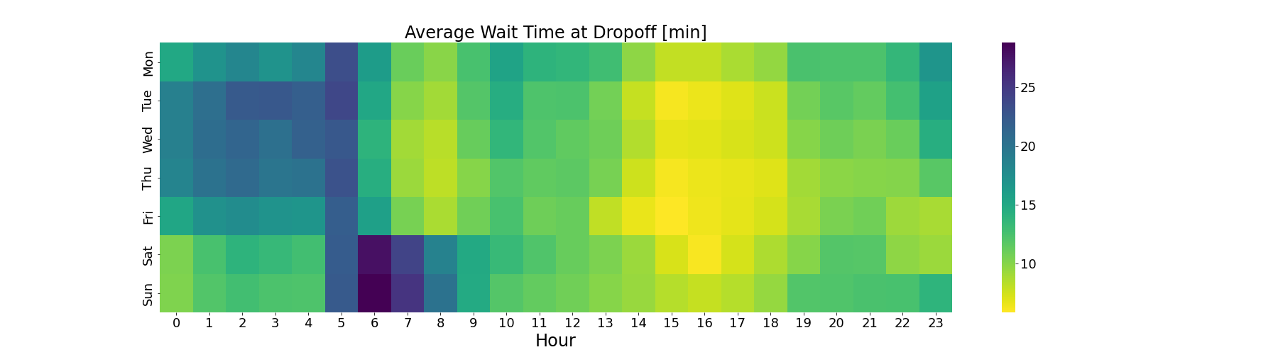
Wait time and number of pick-ups are strongly correlated
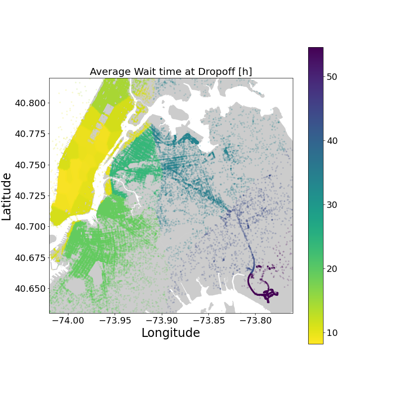
The correlation also holds for the location. We should keep this in mind when giving taxi drivers insights on how to increase their hourly income.
Average Speed
For the fare calculation, it will be important to know the average speed of trips. Here, we give the average speed for rides starting in a given cluster. This makes visualisation easy.
! Average speed
For the fare calculation, it is more accurate to use the average speed for going from one cluster to another, but as we can see, the cluster speed is kind of smoothly increasing away from lower Manhattan.
Predictive Modeling
With all the features available, it should be fairly easy for a good regression model (e.g. XGBoost) to predict the fare given the route and time of the day. However, taking a close look at the data, I had the idea to try a simple approach to predict the fare. The fare is composed of 3 parts: 1) The first 0.2 miles or less cost 2.5$ 2) Further 0.2 miles cost 0.5$ 3) 0.5$ per minute that is travelled under 12 mph
So all we need to do is to figure out how much time is spent travelling under 12 mph from the average speed (or the expected average speed when we are forecasting). It is intuitive that when the average speed is 12 mph on average half of the time is under 12 mph. Putting some more thought into this, I realised that this is only true if the underlying distribution is symmetrical and generally we don’t know how the speed is distributed. But we can estimate it quite accurately. Let’s say, we divide the average speed into 5 categories: very slow - 100% under 12 mph slow - 70% under 12 mph average - 50% under 12 mph fast - 20% under 12 mph very fast - 0% under 12 mph where both the boundaries of each category and the percentage are chosen somewhat arbitrarily. With this setting, we can predict the fare price 90% accurately given the average speed. We can now run an optimiser over both the percentage and the boundaries to find better values leading to an accuracy of 95%, where we now used the average speed of the pick-up cluster instead of the average speed of the trip.
We avoided using a time-consuming regression model such as XGBoost to run over the large set of data. The regression model would be more accurate because it takes more variables into account such as time of the day, day of the week and more. On the other hand, the simple model I chose is very robust. I trained it on the data for one month, but when applying it to other months, it yielded similar results.
Fare distribution
Below, we show how the fare amount is distributed.
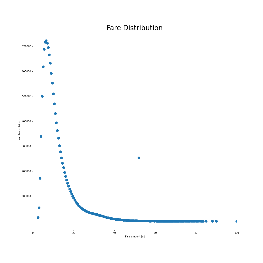
The points follow a skewed Gaussian distribution with one exception being at 52$. This peak can be identified as airport trips to JFK which are happening at a fixed rate. We can estimate the taximeter fare for these trips using our model and find that almost always, the fixed rate JFK trips are more beneficial to the driver than using the taxi meter. Looking at the wait long average wait time at the airport, it makes sense why the prices are higher. However, assuming that a taxi driver takes a trip to the airport, waits the average wait time and takes a trip back, we find that the income would still be above the average income.
The most effective driver
So far we have not fully used the driver ID to the fullest. It turns out to be a gold mine for data solving our initial objectives. We can draw conclusions about what differentiates high-earning drivers from low-earning drivers and draw insights on how to improve the income of our taxi company.
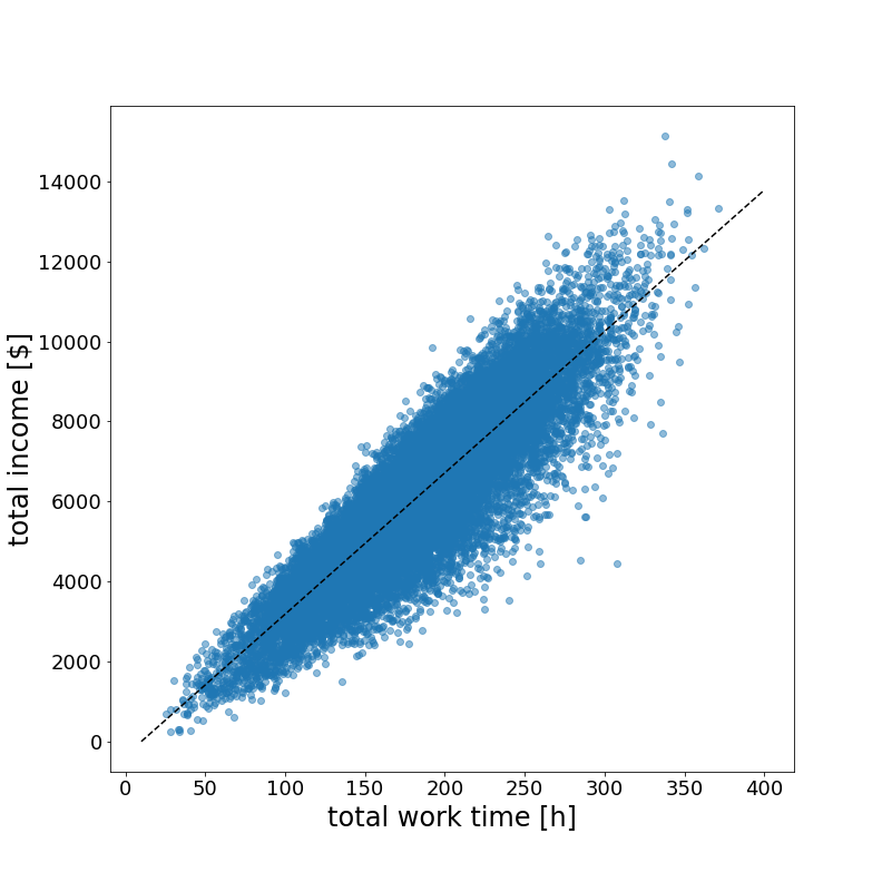
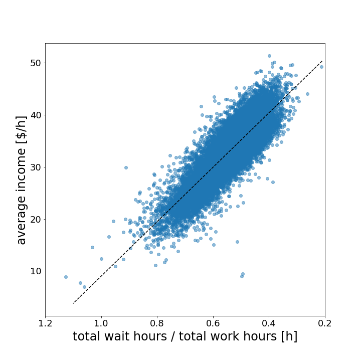
The data reveals two simple but powerful statements. First, the more hours the drivers work, the more money they earn. Second, the shorter their average waiting time, the more money they earn per hour.
With these insights, let’s follow one of the highest-earning drivers on one of his days.
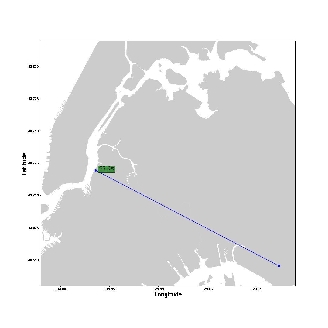
The blue line represents trips with a passenger showing the fare amount in green. The grey line shows the route without passengers to the next pick-up location with the total waiting time in white. Generally, after a drop-off, we want to move towards areas with shorter waiting times. Drop-offs close to the airport are the exception. It is smarter to drive to the airport to get a high-paying ride to the city. Instead of driving a long way to the city without any passengers.
Insights Unveiled
Let’s summarise our main findings:
-
Peak Hours and Hotspots: By analyzing timestamps and geospatial data, we identify peak hours and popular locations for taxi rides. These locations and times lead to short waiting times between rides optimising the income
-
Wait time: Minimising the wait between trips is the most effective way to increase revenue. Moving towards busier areas after dropping off passengers reduces the wait.
-
Fixed-fare Rides: Always take 52$ airport rides. If passengers want to negotiate a fixed fare price, we can use the fare model to calculate whether the price is better than the taxi meter.
Obstacles
The difficulty with this data set was the sheer volume of the data. The massive amount of trips together with the large number of features made it difficult to understand where to start and how to draw meaningful insights from the data. The two crucial steps were the geospatial feature engineering of clusters and creating a data profile for each driver including their waiting times and the start and end of their shift. Combining these two features, we were able to unravel meaningful correlations and provide taxi businesses with powerful data-driven insights.
Conclusion
In this data science project, we’ve harnessed the power of the NYC Taxi Fare dataset to unearth valuable insights for taxi companies. We found that the most important property is the wait time after a trip. Companies like Uber have the advantage that drivers are connected directly to passengers nearby which decreases the wait time, especially in less busy areas. Another advantage is the variable fare. Instead of only taking distance and travel time into account, the demand plays an important role. Increasing the price when the demand is high, incentivises more drivers to work during these hours which maximises the revenue even more.